Service Level Comparison Report
Objective: Gain an understanding of the Service Level Comparison report
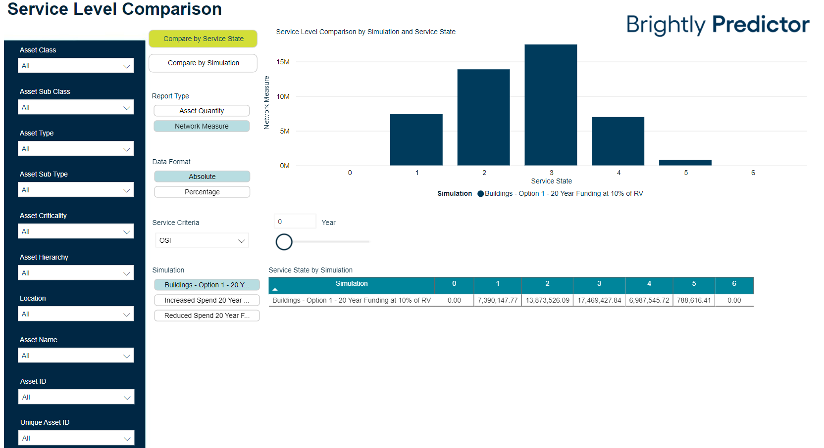
This report displays the distribution of the asset stock across the service criteria ranges for each Service as well as the OSI and any other custom Service Indices for selected simulations.
Once the Workspace is loaded, users can click on the 'Advanced Comparison' tab to view the Advanced Reports.
Users can then click the 'Service Level Comparison' button to load the Service Level Comparison report in a new browser tab:
To compare multiple simulations, select to highlight one or more simulation names found within the Simulation section on the left:
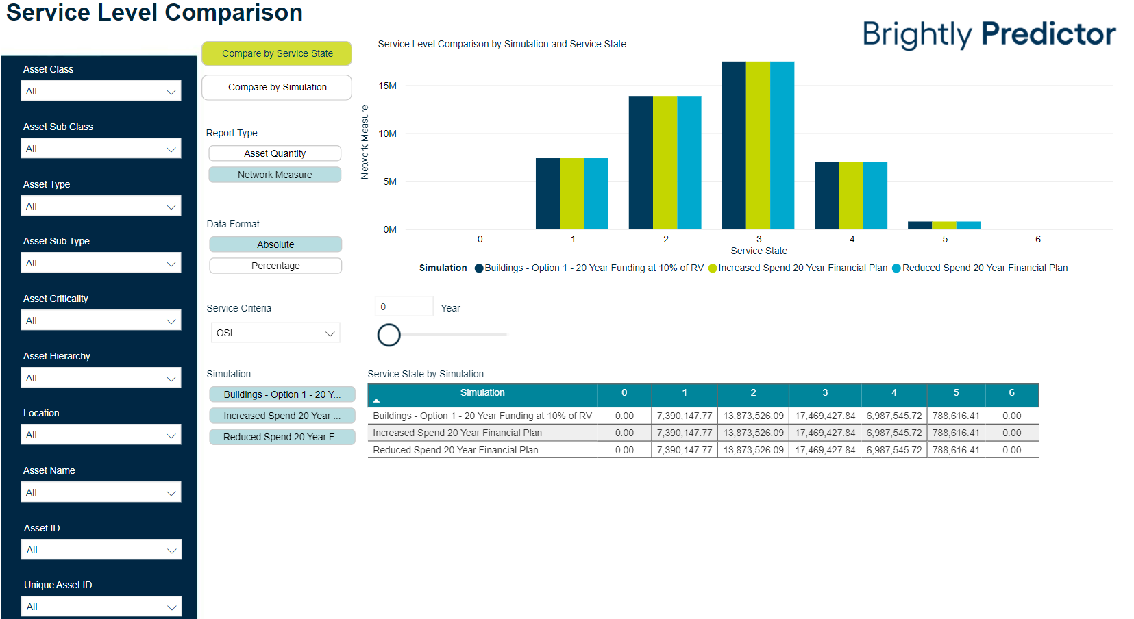
For the selected simulations, users can now compare the distribution of the asset stock across the service criteria ranges for each Service, to view how these values may change based on each simulation's financial plan.
Comparisons can be viewed by either Service State, or by Simulation, using the available buttons:
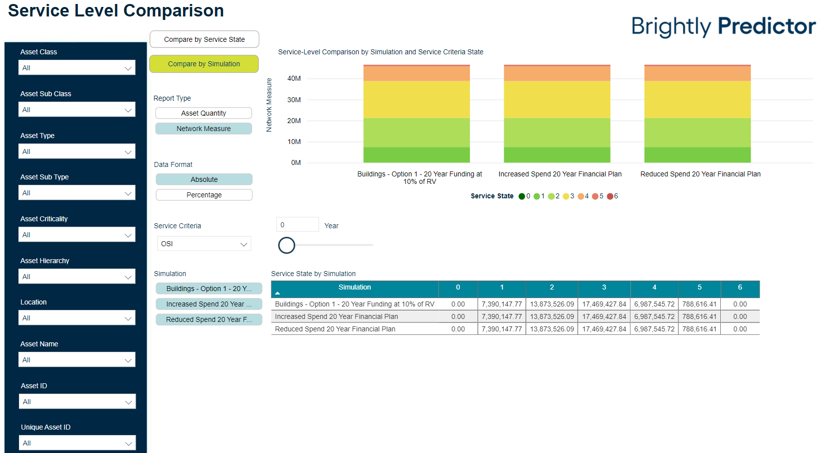
The Report Type can also be changed to use either Asset Quantity or Network Measure, and the values displayed in the report can be changed to display as either an absolute value or as a percentage.